Wild Ride Selati
BRAND STRATEGY | IDENTITY SYSTEM DESIGN | COPYWRITING
Challenge
Develop a sporty and outdoorsy brand identity for a truly unique mountain biking experience hosted at one of South Africa's premier Big 5 game reserves.
Scope
-
Brand strategy
-
Identity system design
-
Signage design
-
Merchandise design
-
Social content creation
Results
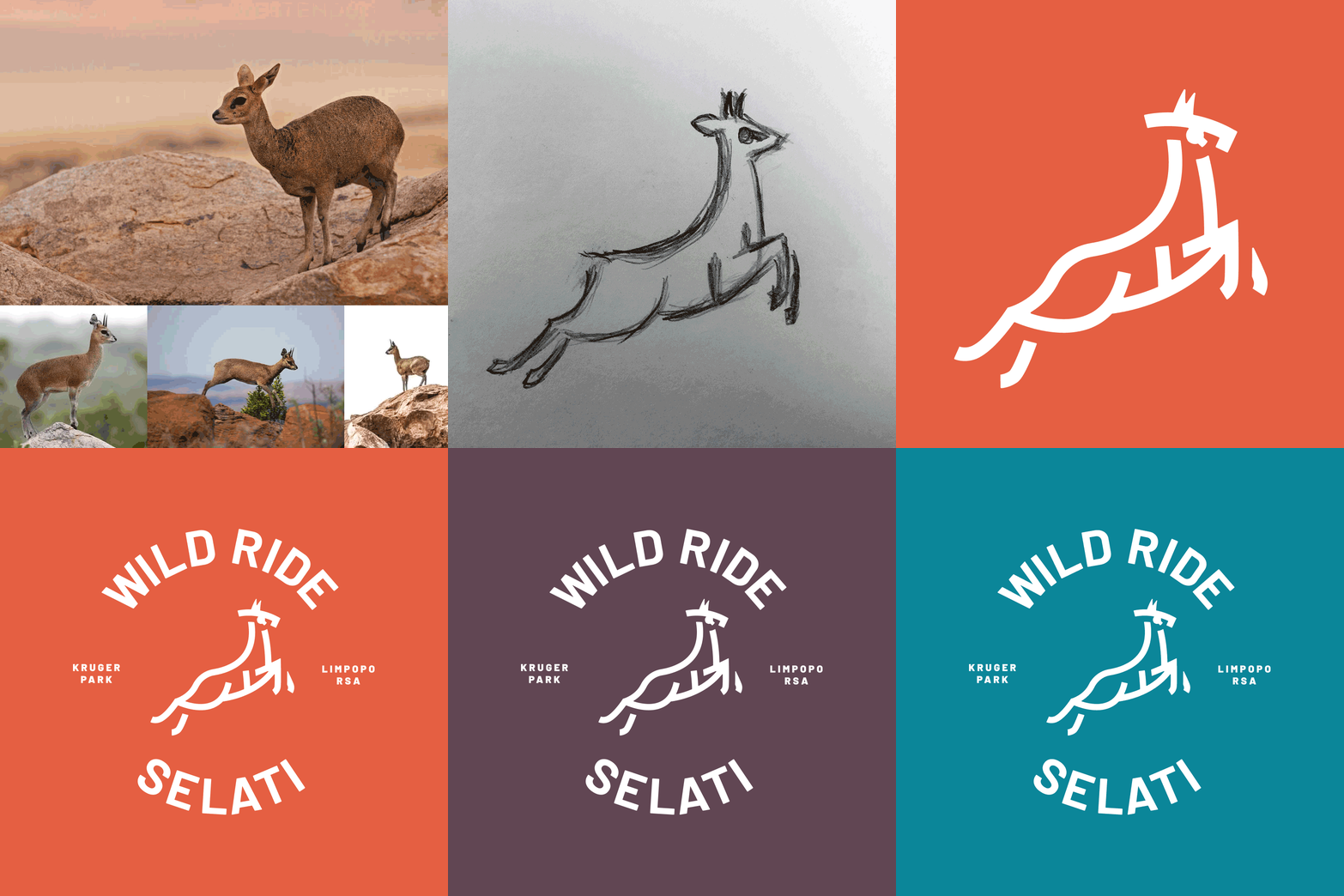
The brand identity – spearheaded by the "Bokbok" klipspringer icon – was well received, offering a wide variety of merchandising opportunities for the event.
Context
Wild Ride Selati organiser, Jared Cavé, approached me with a brief to create a brand identity that would set it apart from other mountain biking events, as it is truly an experience like no other.
Additionally, he wanted a brand that would help create a line of merchandise cool enough that even non-participants would want a piece of the action. From the get-go, we wanted the logo to look great when applied to caps and t-shirts.

Opportunity
The Selati Game Reserve, in South Africa's beautiful Limpopo province, is typified by its rocky outcrops, indigenous scrub and undulating hills, making it the perfect venue for a unique mountain biking adventure. The fact that it's home to Africa's Big 5 might scare some folks away, but that's exactly why Jared wanted the Wild Ride to be hosted there. It offers an experience unparalleled in the mountain biking world.
We chose the klipspringer (which translates literally from Afrikaans as "rock hopper") to be the icon for the ride due to its innate speed, agility and rock-hopping ability – all of which are qualities sought after by the best of mountain bikers.
Goal
We wanted to steer clear of the use of bicycle related imagery, so prevalent in the identities of similar events, to create a brand mark and identity cool enough that even non-riders would want to buy the resulting merchandise.
Solution
Using broad strokes, I created a stylised klipspringer icon, dubbed "Bokbok", to be the champion of the brand. The bold, simple typeface was slightly modified by rounding its sharp edges to complete the look.

Identity system
After the creation of the Bokbok icon, evocative of African cave paintings, we fleshed the brand out with a few additional logo lock-ups, a simple yet versatile brand pattern, and a colour palette which is vibrant and earthy at the same time.

Online presence
Next, we came up with a simple social media campaign making use of Instagram for panoramic carousels, and Facebook and LinkedIn for more generic advertising.
Enticing copy and evocative imagery – treated with bright overlays – were used to draw potential riders in.

Merchandise & branding
The varied elements of the Wild Ride brand asset pack, combined with the brand's bright colour palette and a funky paint stripe effect, allowed us to produce a wide array of merchandise and event branding touchpoints that any sports nut would love the look of.
Outcomes
Aided by its bold, vibrant brand identity – and championed by the Bokbok icon – the first Wild Ride Selati was a roaring success. The event and its merchandise are set to scale new heights in the coming years, so watch this space!
Client feedback
JARED CAVÉ
ORGANISER – WILD RIDE SELATI
I knew Nic was just the guy to help us build this brand.
"Having worked with Nic a few times in the past, I knew he was just the guy to help us build the brand for the Wild Ride. His passion for sports and talent for design are obvious in the results, and we're stoked with the way everything has turned out. We look forward to working with him on building out new and exciting branding and merchandising for all of our future events.”


