Nu Poll Merino
BRAND STRATEGY | IDENTITY SYSTEM DESIGN | COPYWRITING
Challenge
Develop a new brand identity system for a group of South African Merino sheep farmers, allowing them to take their joint venture to the next level and stand out from the crowd in the agricultural market.
Scope
-
Brand strategy
-
Identity system design
-
Copywriting
-
Signage design
-
Merchandise design
-
Social content creation
Results
The brand was exceptionally well received at the launch during the annual Eastern Cape livestock sale of 2021, and the business continues to go from strength to strength in difficult times.
Context
Nu Poll Merino are a consortium of poll merino breeders from the Middelburg area of South Africa’s beautiful Eastern Cape province. Their polled (hornless) rams are notable for their excellent conformation and high quality wool.
When I was approached by Eben, Rob and Stuart of Nu Poll to help them with their rebrand, I knew we’d be able to build something special together: a local brand capable of developing a cult following that transcends their sector in much the same way agricultural giant, John Deere, does.

Opportunity
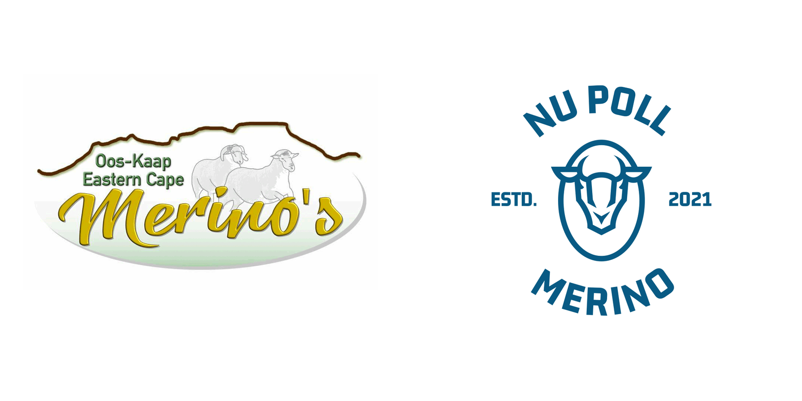
Initially operating under the "Eastern Cape Merinos" moniker, Nu Poll sought to differentiate themselves from competitors by establishing their position as poll merino specialists. Their original branding was dated and didn't convey any of the feelings of trust and expertise that the farmers who make up the consortium itself do.

Goal
My aim with this project was to provide a logo and branding system that would evoke the sense of credibility that the Nu Poll Merino farmers themselves exude, while giving a nod to their tongue-in-cheek nature.
Solution
I supplied a brand identity that feels established and modern at the same time, imbued with the same confidence, ruggedness and sense of humour that defines the farmers of the Eastern Cape.

Identity system
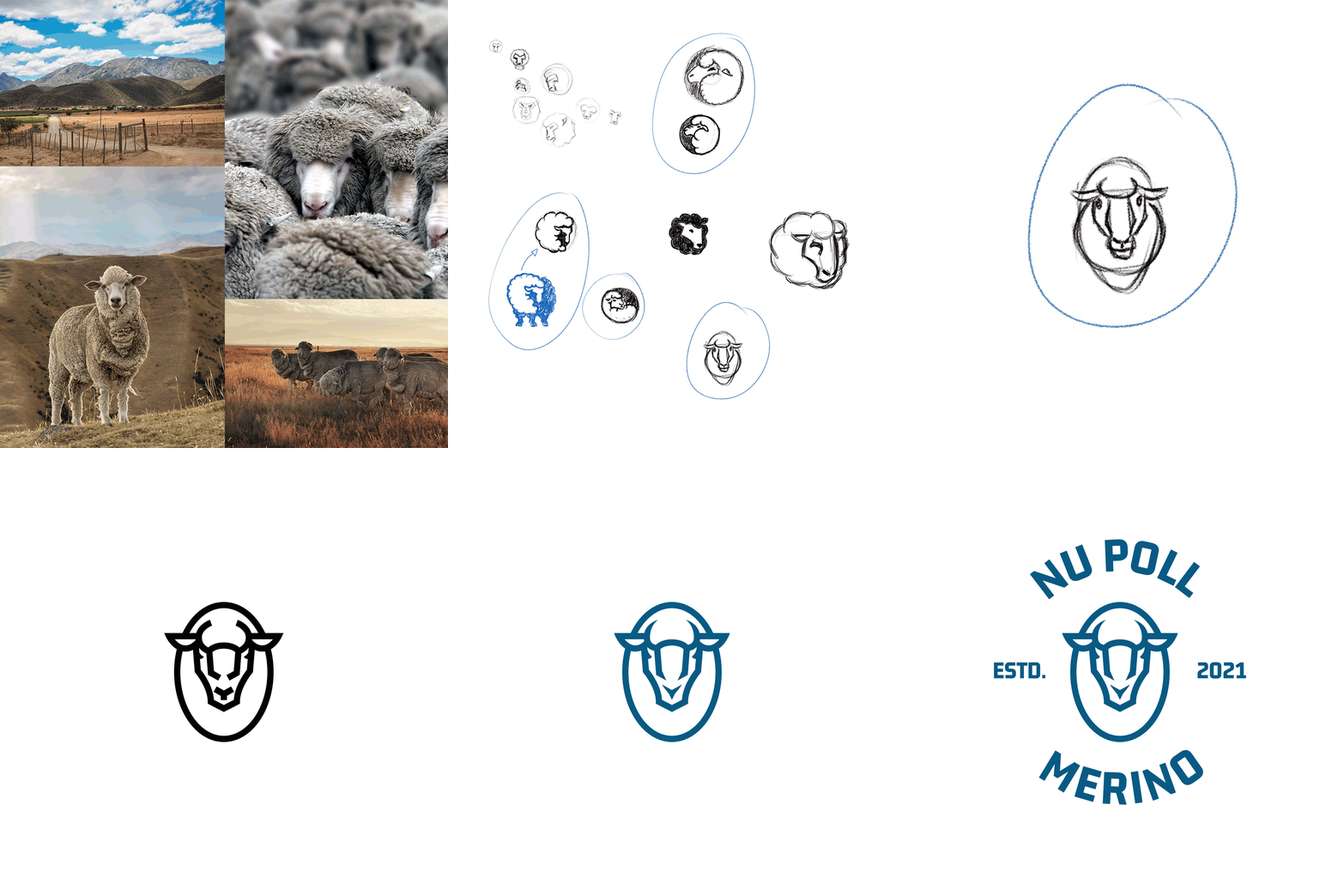
The major challenge in the initial design of the logo was developing an iconic mark that was obviously a ram, without horns. This was achieved by emphasising the male merino's prominent nose ridges, and by using bold linework to form the mark.
From the get-go, the logo was designed with adaptability and marketability in mind, so an extensive brand asset pack – including multiple logo iterations, badges and a wool-knit tyre track pattern – was developed.


Brand stylescape
I used bold type treatments and a colour palette reminiscent of vintage Ford tractors to speak a brand language that would endear itself to both farmers and the general public.
The benefits provided by polled sheep are evident in their fleeces – they produce more wool of a higher quality, and are less likely to hurt each other in territorial battles. Developing the launch campaign copy was a no-brainer once I knew this.
With a masculine and iconic poll merino ram’s head as their talisman, and a tongue-in-cheek voice that speaks directly to the spirit of the farmers themselves, the Nu Poll Merino brand is already generating fans in the Eastern Cape and beyond.

Vehicle branding
The versatility of the Nu Poll brand asset pack ensures that the brand is able to look at home on any vehicle, enabling the farmers to take the ram with them wherever they go.
Merchandise
The multiple possible applications presented by the logo and assets further allowed us to develop a potential alternative revenue stream for the brand through a line of merchandise that's already gaining in popularity down in the Eastern Cape, from the Karoo to the coast.

Social media
With the merchandise set to be released in limited edition drops, in-your-face social media campaigns driving traffic to the website are sure to stop you dead in your scroll.

Outcomes
The Nu Poll brand overhaul was exceptionally well received at the launch during the annual Eastern Cape livestock sale of 2021, and the business continues to go from strength to strength in difficult times. Look out for their merchandise drops around livestock sale season in the first quarter of every year.
Client feedback
EBEN DU PLESSIS
FOUNDER – NU POLL MERINO
Nic gave us exactly what we didn’t know we needed.
"We came to Nic with a pretty rigid brief which would have resulted in our new brand getting lost in a sea of sameness with all of our competitors. He quickly saw where we (and they) were missing the mark in terms of what was required to stand out in the market, he went to work, and he nailed it! He exceeded our expectations and gave us exactly what we didn’t know we needed.”


